Recently I ran out of Azure credits before the new billing month was started. The result: Azure automatically disables the account and none of my resources were available. Next question was: how can I use Power BI to keep track of my credits? Can I Power BI help me in managing my Azure credits?
Azure Management API
With powerbi.com there is a content pack related to Azure, but it creates an operational dashboard and there are no spending reported. So I had to create it myself. Luckily a lot of Azure resources/services are available via different REST APIs. The Azure Resource Manager REST API was my first try. Is provides access to resources available within a subscription. But it doesn’t contain consumed quantities and/or related amounts. My next try was the pretty new (in preview since summer 2015) Azure Billing REST API which consists of two calls: one for the pricelist and one for the consumed quantities. In both datasets a meterid can be used to link them together.
Power BI
RateCard
Now it is time to fire-up Power BI desktop to retrieve those two datasets and link them together and create a nice dashboard. The structure for the pricing list (RateCard) API call is:
https://management.azure.com/subscriptions/{subscription-Id}/providers/Microsoft.Commerce/RateCard?api-version={api-version}&$filter=OfferDurableId eq '{OfferDurableId}' and Currency eq '{Currency}' and Locale eq '{Locale}' and RegionInfo eq '{RegionInfo}'
- subscription-Id – identifier of the Azure subscription. Can be found in the portal.
- api-version – 2015-06-01-preview. The only value available.
- OfferDurableId – what type of subscription. Can also be found in the portal together with the burn rate. Can also be found at: https://azure.microsoft.com/en-us/support/legal/offer-details/
- Currency – the currency of the pricelist
- Locale – the locale of the return resources
- RegionInfo – 2 letter ISO code of where the subscription is purchased.
Currency, Locale and RegionInfo needs to be a valid combination, so not all currencies are possible with different locales and regioninfo. In my case I had to use EUR, nl-NL and NL to get the pricelist in euro’s. Also the querystring only accepts ‘eq’ and ‘and’.
Resource Usage
The other API call within the billing REST API is the Resource Usage. The structure of the API call is:
https://management.azure.com/subscriptions/{subscription-Id}/providers/Microsoft.Commerce/UsageAggregates?api-version={api-version}&reportedStartTime={dateTimeOffset-value}&reportedEndTime={dateTimeOffset-value}&aggregationGranularity={granularity-value}&showDetails={showdetail-boolean-Value}&continuationToken={token-value}
- subscription-Id and api-version are the same as the RateCard call.
- reportedStartTime and reportedEndTime are datetime values in ISO 8601 format and URL escaped, so 2016-01-01T00%%3a00%3a00%2b00%3a00 as 2016-01-01T00:00:00+00:00 (Midnight Januari 1st 2016UTC). There is a difference between reported and usage time. See theMSDN article for more information: https://msdn.microsoft.com/en-us/library/azure/mt219001.aspx
- aggregationGranularity – Daily or Hourly.
- showdetails – Either show multiple instances of the same type aggregate during the granularity time period.
- continuationToken – If the result is too big to return in one call, this parameter is being used to retrieve the rest of the results. As far as I know Power BI doesn’t have build-in logic to deal with paging, so I ignored it and capped my time period to 6 months.
Power BI Modelling
Now that I know which REST API calls to use, I could create a Power BI dashboard. First I created a small table and entered by hand the subscriptionID, currency, locale and regioninfo. Of both API calls (RateCard and Resource Usage) I created a function to retrieve the information and return a formatted table. And in the end I created two tables based from the manual entered table with either the pricelist and the usage. And as a last step I merge those two tables using the meterID, which is the linking pin between the two API calls.

Last step I added a dates table which has also ta column of the related ‘anniversary’ date on which the new billing month is starting. This date I use for a ‘MTD’ calculation.
After creating the relation between dates and Usage I was able to create a simple report: a line chart with the MTD calculation and a reference line of my monthly credit.
Data validation
I started this post by telling that I ran out of credit end of February. But the spike of February is not touching the red line. So what happened? The problem I found is that the result returned by the RateCard call, is missing some meters. And in my case it was a standard WebJob which cost me €11.80 a month. If I add that amount to my total, I would indeed hit the monthly limit. At this moment I changed the pricing tier of my WebJob to a free version and my total consumed credit would be correct.
What’s next
I don’t have a nice dashboard yet, so that would be a good point to continue. Also I will add some measures for extra insights, like current remaining credits, consumed credits, burn-rate and remaining days. After that I will make the Power BI desktop file available and update this post (or write an additional one).
-JP
Appendix
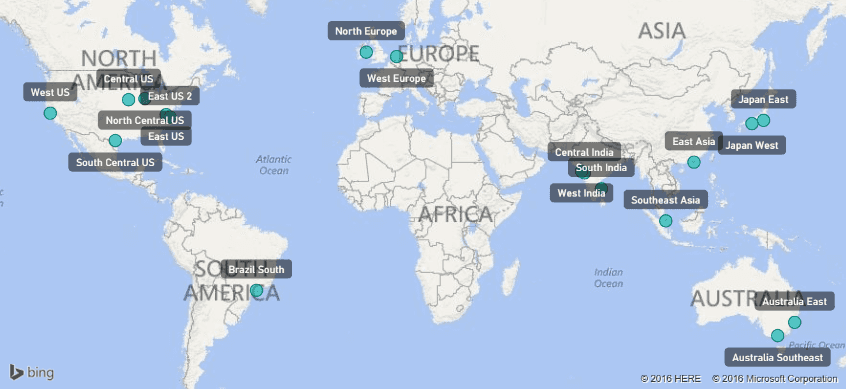
While playing with the Azure Management API I noticed a nice API call: ‘List all of the available geo-locations’ (https://msdn.microsoft.com/en-us/library/azure/dn790540.aspx). Azure is running in 18 locations round the world and I can locate my resource in one of those datacenters. But I, and many, has always wonder where those datacenters are located. There are some lists available on the Internet, but the result of this call has, surprise, a datacenter name and longitude, latitude information. So this information can easily plotted on a map using Power BI. Just use the following URL as a starting point and convert the result to a table:
https://management.azure.com/subscriptions/{subscription-Id}/locations?api-version=2015-01-01

And when plotted that information with Power BI to a map, the result looks like this. I must say that the geolocations are not the real location, but nearby.
